
During my co-op at WSIB, I worked in the Innovation Lab—a start-up–like, cross-functional team that partners across the organization to prototype quickly and ship internal tools.
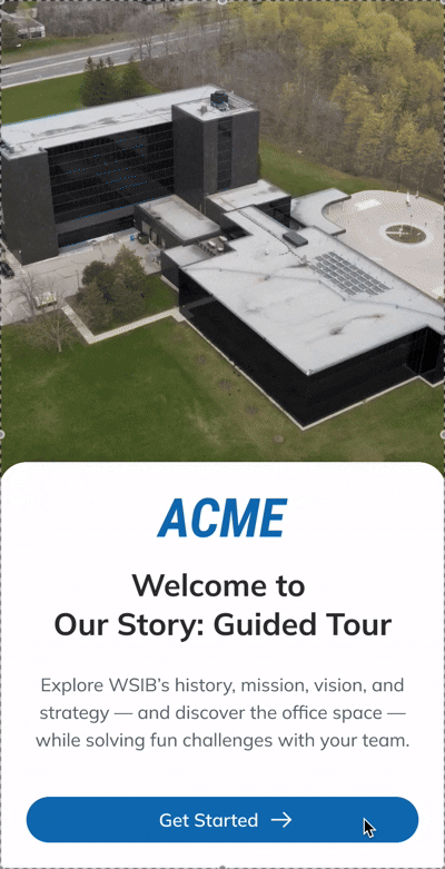
The HR learning team approached us to design a key activity on orientation day: a guided tour that helps new hires learn about WSIB.
The orientation was previously delivered fully virtually and was largely lecture-based. New hires struggled to stay engaged and retain key information. For facilitators, it was hard to track participation and manage the session in real time, with many updates and measurements handled manually.
With the opening of WSIB’s new headquarters, orientation day shifted to an in-person format, allowing us to design collaborative activities around the physical space and on-site equipment.
How might we create a guided tour for orientation day that keeps new hires actively engaged while clearly communicating WSIB’s mission, vision, history, and strategy?
We designed the guided tour as a learning game that blends a scavenger hunt with short quizzes. Across the new HQ, 6–10 learning stations feature large displays or posters, each highlighting one aspect of the company’s culture and strategy.
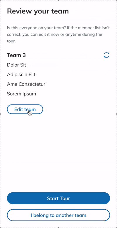
New hires’ experience follows a simple loop: team up → explore → challenge → reward. In small teams, they move through the stations, learn from the exhibit content, and use their phones to answer questions and earn points.

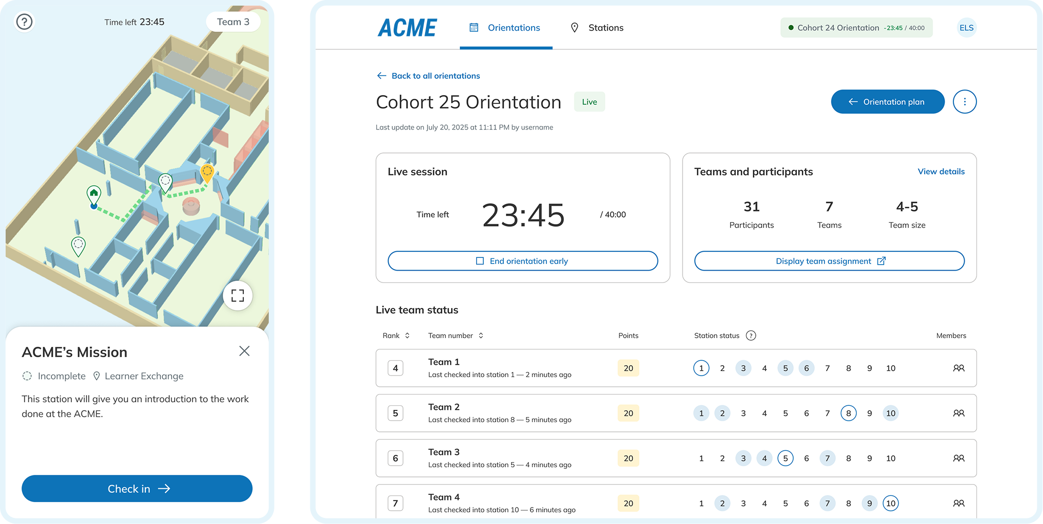
To support this flow in a live, in-person session, we built a real-time digital platform with a user tool and an admin tool, backed by a central database. Together, these tools enable facilitators to run the session end to end—from setting up teams and stations, to monitoring progress in real time, to reviewing and finalizing results at the end of the session.


Because the request started as a broad, open-ended problem and team capacity shifted across the project, we approached delivery in phases. For each phase, we planned in detail upfront, while the scope and priorities of later phases evolved as we learned more through delivery.

At kickoff, the request was intentionally high level: design an in-person guided tour for orientation that feels engaging and interactive. A scavenger hunt quickly emerged as a natural direction—but it still left key questions open about how the session would run, what facilitators needed to manage live, and what benefits it brought.
Given the short timeline, we did not run a full research cycle. Instead, we used our own recent experience of the previous online onboarding as a baseline, and worked closely with stakeholders to surface facilitator needs and pain points.
To clarify the constraints, I asked stakeholders about practical details such as session length, typical cohort size, where the tour could take place in the building, available equipment, facilitator capacity, the broader agenda of orientation day, and the desired level of competitiveness. These inputs grounded my design decisions and strengthened the rationale behind each choice.
To ensure we met the launch deadline without compromising the core experience, I led a prioritization session with stakeholders and leadership. We mapped all proposed features onto an Effort vs. Impact matrix, categorizing them into Must-have, Nice-to-have, and Backlog.
Some tradeoffs we made:
To align stakeholders and the engineering team, I developed a multi-layered system flow that visualized the interplay between three core components: the physical space, the user tool, and the admin tool. This diagram served as the "source of truth" for the project; I updated it through five iterations as we refined the scope and addressed technical constraints across delivery phases.


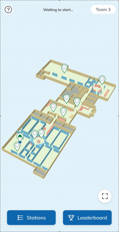
In Phase 1, our proposal for an interactive map on user tool was favoured by stakeholders for its dual purpose: providing game navigation and serving as an engaging tool for learning the HQ layout. This story shared more detailed process of how we created the digital assets and integrated them into the in-person experience.
At the start of Phase 2, I leveraged my architectural design background to lead research on the visual styles and custom-build effort, while my dev colleagues audited automatic map generation tools. After evaluating budget and performance, we opted for a custom-built, low-detail 3D model in perspective view.

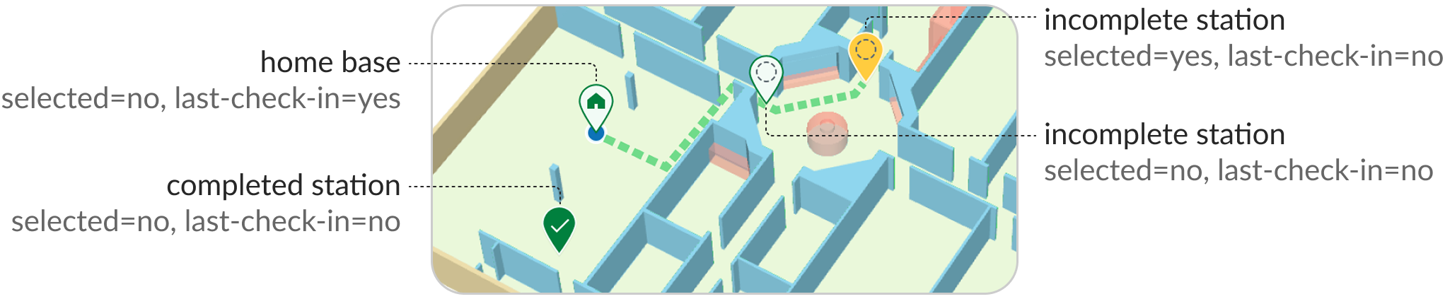
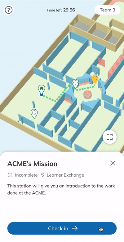
“It would be great if the app can show participants’ real-time location,” suggested a stakeholder. While real-time tracking is appealing, indoor navigation requires high-effort hardware (Bluetooth) and a native app. As a turnaround, we designed station-to-station navigation using the team's most recent check-in as the start point and calculate the path to any selected station via A* pathfinding algorithm.
A component set of different types of map pins was designed, where the last check-in was indicated with blue dot, and the selected station was shown in yellow.
To refine the experience in physical space, we implemented three key adjustments:
1. Randomize the first stations →
Programmed the system to suggest a random first station for each team, avoiding a linear path and distributing the cohort across the building.
2. Use 4-digit codes
3. Add location recovery
To refine the experience in physical space, we implemented three key adjustments:
1. Randomize the first stations
2. Use 4-digit codes →
Used 4-digit check-in codes instead of QR codes to prevent bottlenecks and physical crowding at learning stations.
3. Add location recovery
To refine the experience in physical space, we implemented three key adjustments:
1. Randomize the first stations
2. Use 4-digit codes
3. Add location recovery →
Added a help popup with touch gesture instructions and a "locate me" function to help users restore the current location without affecting game progress.

Team-based activity promotes communication and reduces individual burden. While designing team management for the admin tool was straightforward, applying it to the user tool required a significant pivot to account for real-world inconsistencies.
To support the facilitator’s workflow, the admin tool enables batch CSV imports and automatic team assignments. Facilitators can manually reassign teams as needed. On orientation day, team roster is displayed on the large screen and provided as printed sheets at each table to ensure everyone knows their assignment.

Since the user tool is a no-login web app, the system tracks progress by team. I initially designed a setup flow where participants could manually add or remove names from their digital roster to reflect last-minute team reshuffling due to no-shows or unavailable mobile devices.
However, this introduced technical obstacles like item duplication, misspellings, and unnecessary database complexity. After reviewing these hurdles with developers, I realized this was an over-design. In a real-world setting, if a roster changes, facilitators just note it down and update their record.
Back to the design, I removed the unnecessary flow and adjusted the content to give participants a clearer guide. As I built my understanding of this project, I realized that accuracy of game result was not a prioritization; instead, maintaining a smooth, engaging flow was more important than keeping every detail in the system record.
The project concluded at the end of our co-op term. We delivered a fully functional platform and a facilitator guide to the HR Learning team. To ensure a seamless transition, we prepared a comprehensive handoff package including design and development source files, code, and documentation for the succeeding maintenance team.
While our team conducted rigorous internal testing to cover edge cases, I anticipate that further areas for improvement will emerge once the platform is in production. Moving forward, careful observation of live sessions and interviews with both facilitators and participants will be essential for guiding future iterations.
Depending on the HR Learning team's evolving needs and company resources, the project scope could be expanded to support:
Mobile version of the admin tool for on-the-go management.
Preset session templates to toggle specific stations on or off.
Multiple office locations within the same ecosystem.
The interactive orientation ecosystem was recognized as a top 2025 accomplishment within the organization for successful cross-functional delivery.
Starting in 2026, it will be adopted by the HR learning team to support bi-weekly orientations that cover over 500 new hires annually.
This project was an internal, multi-layered system integrated with physical spaces. As a designer taking on PM responsibilities, I led the team from concept to launch in 7 months. My key takeaways include:
Strategic Alignment: I bridged the gap between vague stakeholder expectations and technical execution. By defining the project scope and prioritizing features early, I ensured the team remained focused on high-priority MVP goals.
Technical Feasibility: I maintained a tight feedback loop with developers to ensure designs were buildable. By understanding the backend logic, I balanced user experience with development ROI and contributed directly to QA and technical problem-solving.
Design Efficiency: I prioritized simplicity and ease of use for new employees from diverse backgrounds while ensuring efficient management. To meet the aggressive timeline, I leveraged existing design systems and only created new patterns consciously when necessary.
Accelerated Visualization: Integrating my design expertise, I visualized the UI while drafting the PRD. As AI design tools become more powerful, I believe a designer’s true value lies in a deep understanding of the entire product logic—a mindset I applied throughout this project.
I am eager to strengthen my focus on data-driven design by learning to define quantifiable success metrics at the start of a project. This ensures I can measure the true impact and determine when a feature is "done," preventing scope creep and over-optimization.
Additionally, I want to integrate lean user validation, as simple as a satisfaction survey, to ensure that stakeholder satisfaction is backed by measurable success.
Overall, I thrive as the bridge between tech, users, and business—serving as the go-to person who translates vision into reality.